Unlocking Potential
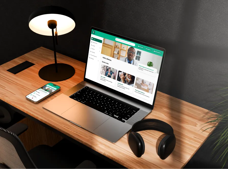
Incrediwear Website Audit
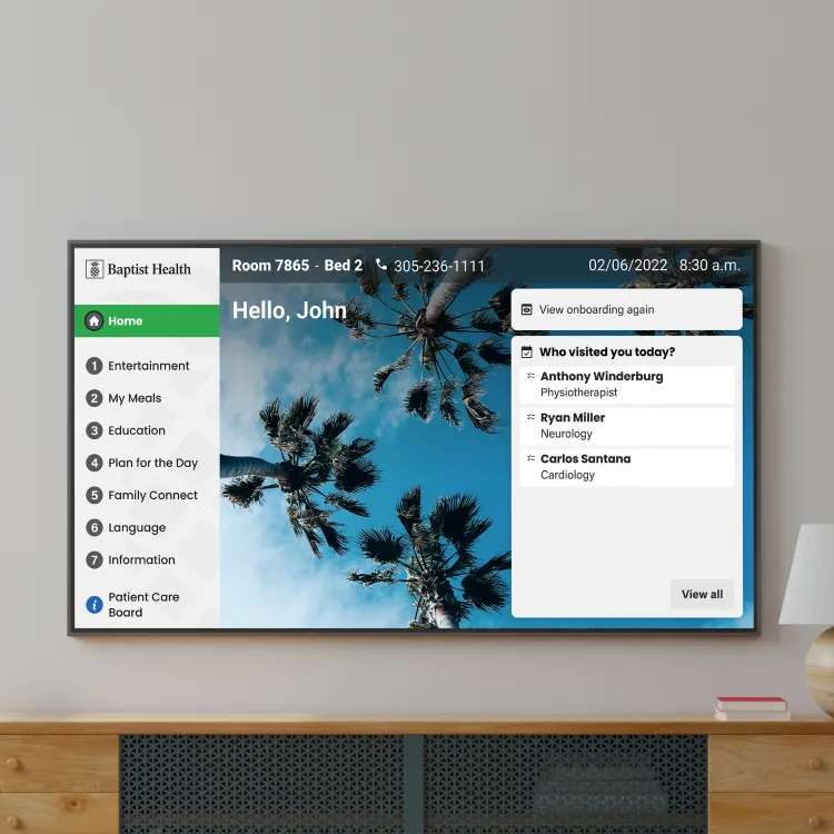
Redesigned the digital smart room experience to optimize patient information and decrease nurse workload.

Areas of Audit
Our audits focus on visuals, user experience, accessibility, and optimization for growth and success insights.

Visuals And Aesthetics
Enhancing audit communications with clear, aesthetically appealing visuals.

User Experience
Improving the audit process for enhanced clarity and stakeholder engagement.

Accessibility
Adapting audit communications to meet diverse user needs, ensuring inclusivity.

Content
Creating precise, engaging audit content to support clear decision-making.

Mobile Vs Desktop
Adapting audit interfaces for optimal access across all devices, ensuring functionality.

Site Conversion Capacity
Leveraging audit insights to improve website conversion rates and user engagement.
Addressing Challenges
Identifying Problems
Our approach involves pinpointing these challenges and devising tailored strategies to ensure our clients not only comply but thrive.

Navigation
Streamlining navigation to enhance user journeys and improve satisfaction and efficiency.

Visual Presentation & Content Layout
Enhancing clarity and engagement through better visuals and content organization.

Usability & Accessibility
Improving ease of use and access for all users, ensuring a more inclusive experience.

Product Display & Information
Streamlining display and information for enhanced product understanding and appeal.

User Interactivity & Feedback
Improving interaction and response mechanisms for a dynamic user experience.

.webp)
Worked flow
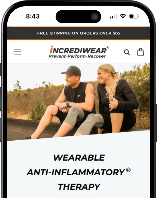
Homepage
Nunc vulputate libero et velit interdum, ac aliquet odio mattis. Class aptent taciti sociosqu ad litora torquent per conubia nostra, per inceptos himenaeos condimentum lobortis.
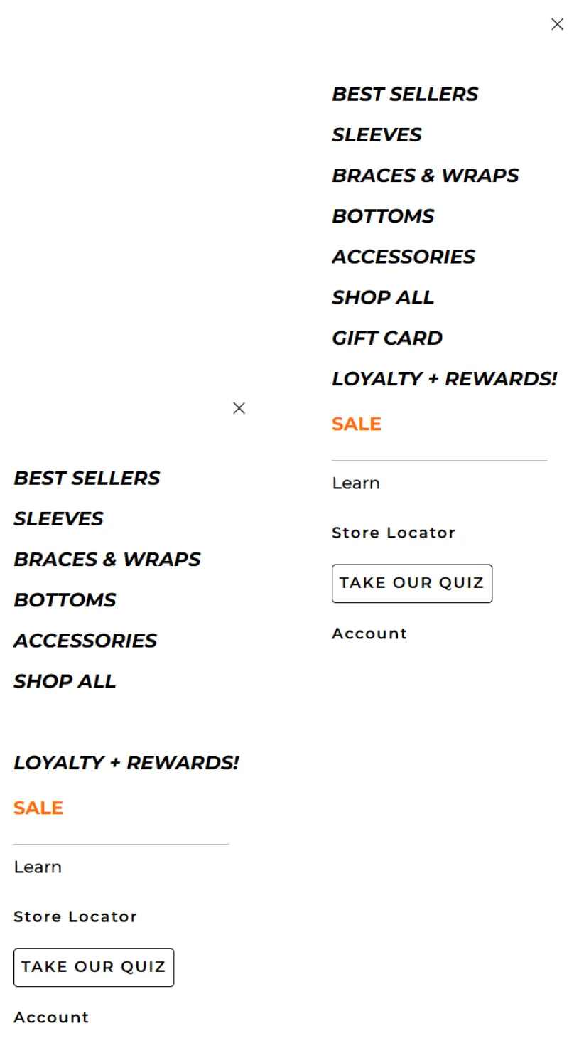
Navigation
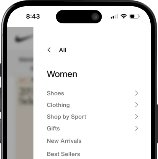
The current menu is too general with items like 'Shop', 'Learn', and 'Sale' which lack specificity.
On mobile, the menu lacks clarity with no distinction between categories and subcategories.
There's no clear separation between men's and women's items except for bottoms, complicating searches for other items like socks.
User mental model for e-commerce are for example
Homepage > women section> socks > purchase.
What happens now it’s a that the user has to answer too many mental questions:
E.g. Where can I find items only for women?
Does S means S for women or S for men?
Homepage > women section> socks > purchase.
What happens now it’s a that the user has to answer too many mental questions:
E.g. Where can I find items only for women?
Does S means S for women or S for men?
%20(3).webp)
Recomendations
Adopting a Progressive Web Application (PWA) is optimal for sites with mainly mobile traffic, offering a mobile-optimized, app-like experience.
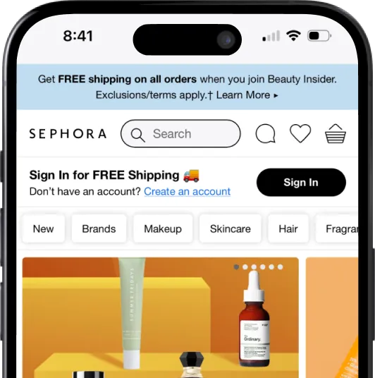
Consider Sephora as an example. Instead of a hamburger menu, it presents easily scrollable categories with the menu conveniently located at the page's bottom.
Implementing a primary menu with distinct categories significantly enhances user navigation, making it straightforward for users to delve deeper into content while ensuring an easy way back.
This structure not only streamlines the user journey but also improves overall engagement by reducing frustration and confusion, leading to a more intuitive and satisfying user experience.
This structure not only streamlines the user journey but also improves overall engagement by reducing frustration and confusion, leading to a more intuitive and satisfying user experience.
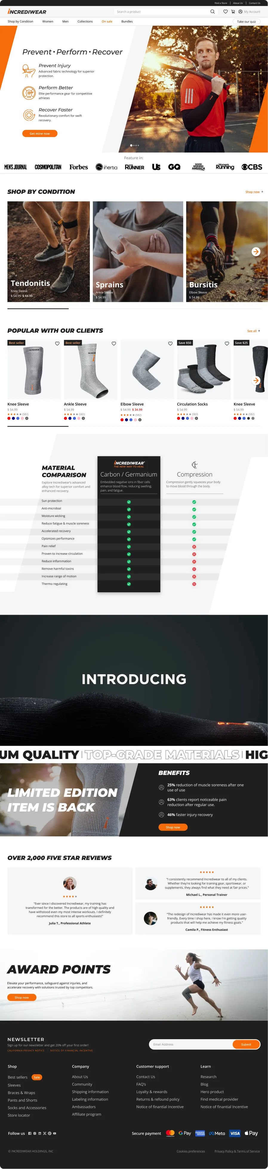
Hero Section
%20(2).webp)
Although the text offers a brand-centric message about "Wearable anti-inflammatory therapy", it doesn’t adequately explain Incrediware's offerings at a glance.
Sections like "Customer love us," "trusted by the pros," and "30-day guarantee" may be more impactful on individual product pages. This placement can provide potential buyers with timely information, aiding their decision-making process during purchase.
Recomendations
The current focus on 'Wearable anti-inflammatory therapy' could be enhanced with a clearer tagline or visual that highlights Incrediware's benefits and features, making the product's purpose immediately clear to visitors.
Additionally, incorporating relevant keywords in that section can boost organic search visibility, potentially leading to improved search results and attracting more targeted traffic to the site.

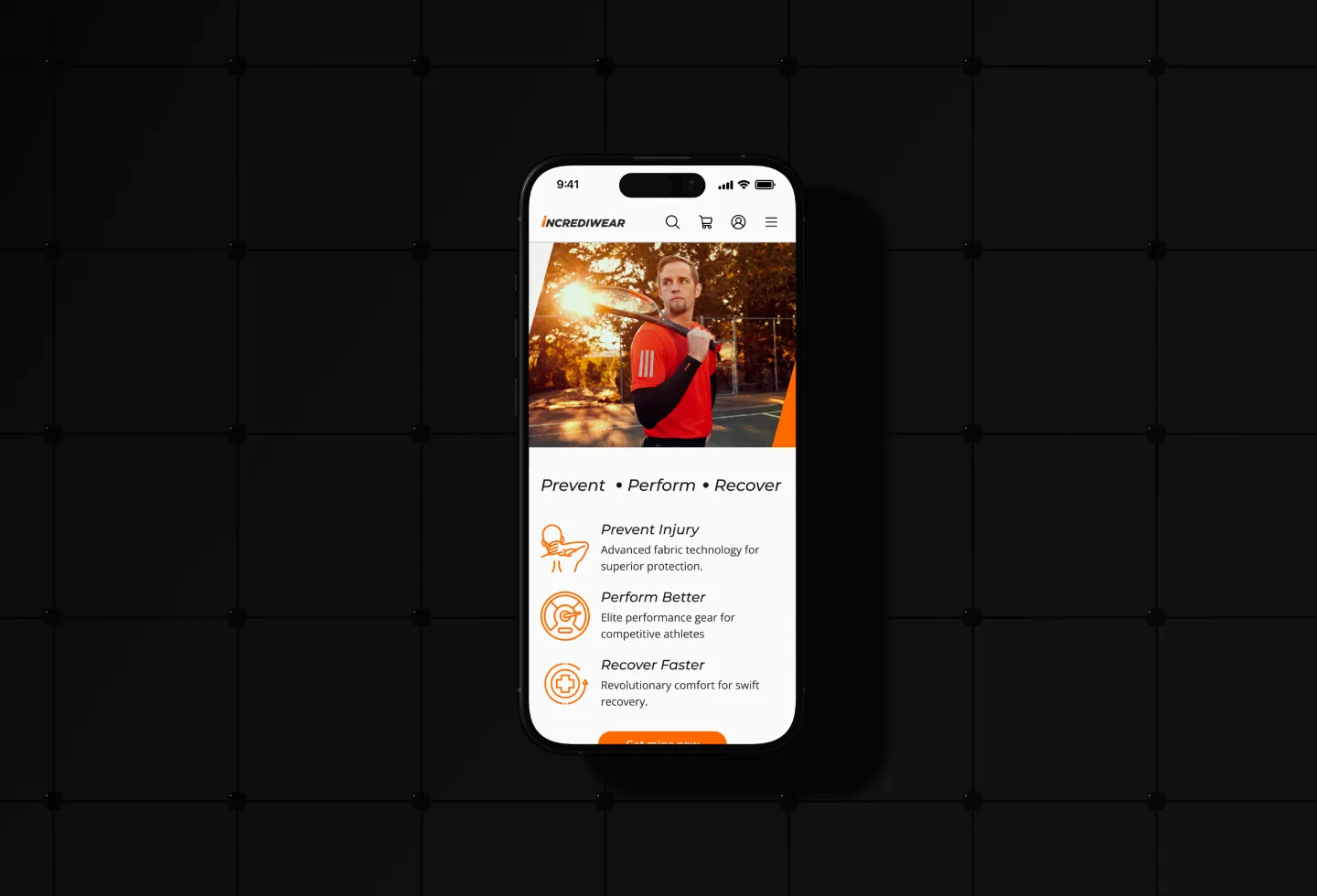
Prevent Injury
Advanced fabric technology for superior protection.

Perform Better
Elite performance gear for competitive athletes

Recover Faster
Revolutionary comfort for swift recovery.
Product in the Homepage
A significant portion of the traffic focuses on the homepage, with the 'best seller' section being the primary showcase for product offerings. The rest of the page is dense with text and lacks sufficient product imagery. Given that users typically spend only 20 seconds on Increadiwear's homepage, it's improbable they'll engage with lengthy text content.
Recomendations
Consider adding auto-play videos in the hero section to immediately engage users, and focus on visuals rather than text to enhance user interaction. This approach can increase engagement and conversion rates by providing an immersive experience right from the start.

Other Homepage Considerations
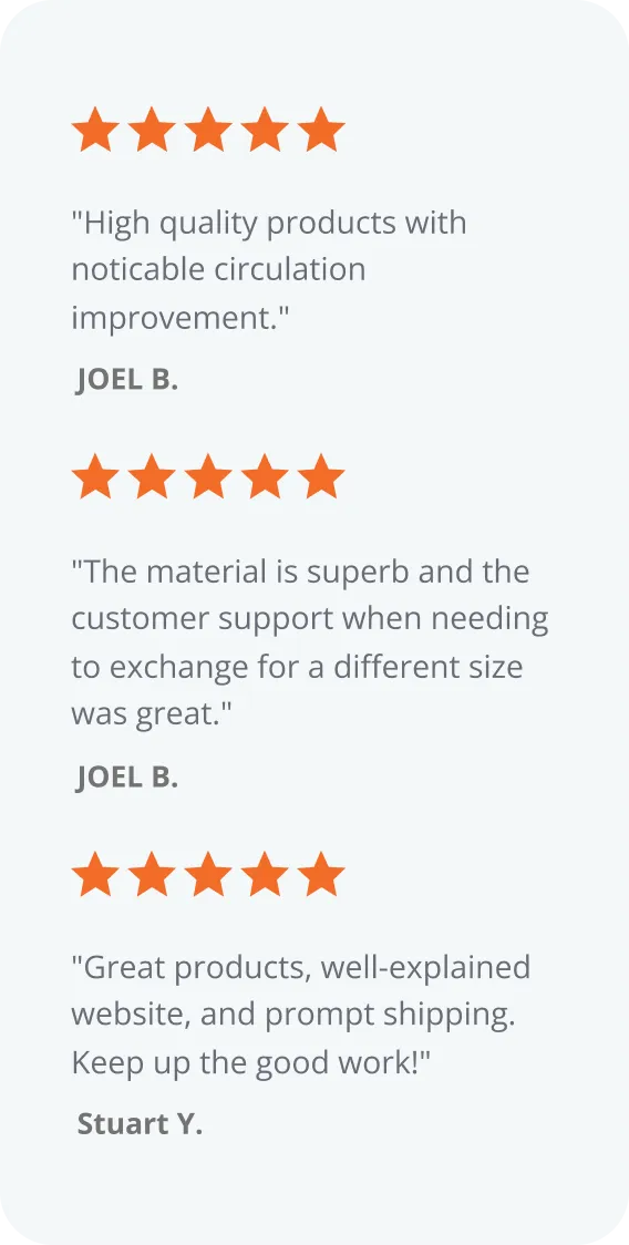
Reviews
Reviews are dispersed throughout the landing page: in customer testimonials, linked to Google reviews, in a dedicated review section, and among product reviews. A more consolidated approach might be clearer.
Shopping Options
The distinction between 'shop as a guest' and 'create account' is not evident, especially on mobile.
Promotions
There's no dedicated section for promotions, missing out on potential urgency-driven purchases. For instance, the limited-edition pink sleeve, positioned above the navbar, is easily overlooked.
Design & Aesthetics
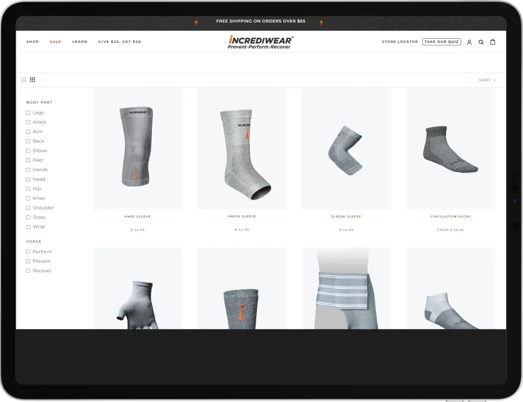
The color scheme has poor contrast, making it hard to read text against gray and orange backgrounds, which is also an accessibility concern.
Products have a premium price but lack a high-quality appearance due to subpar image quality and a monochrome color palette.
Products have a premium price but lack a high-quality appearance due to subpar image quality and a monochrome color palette.

.webp)
Worked flow
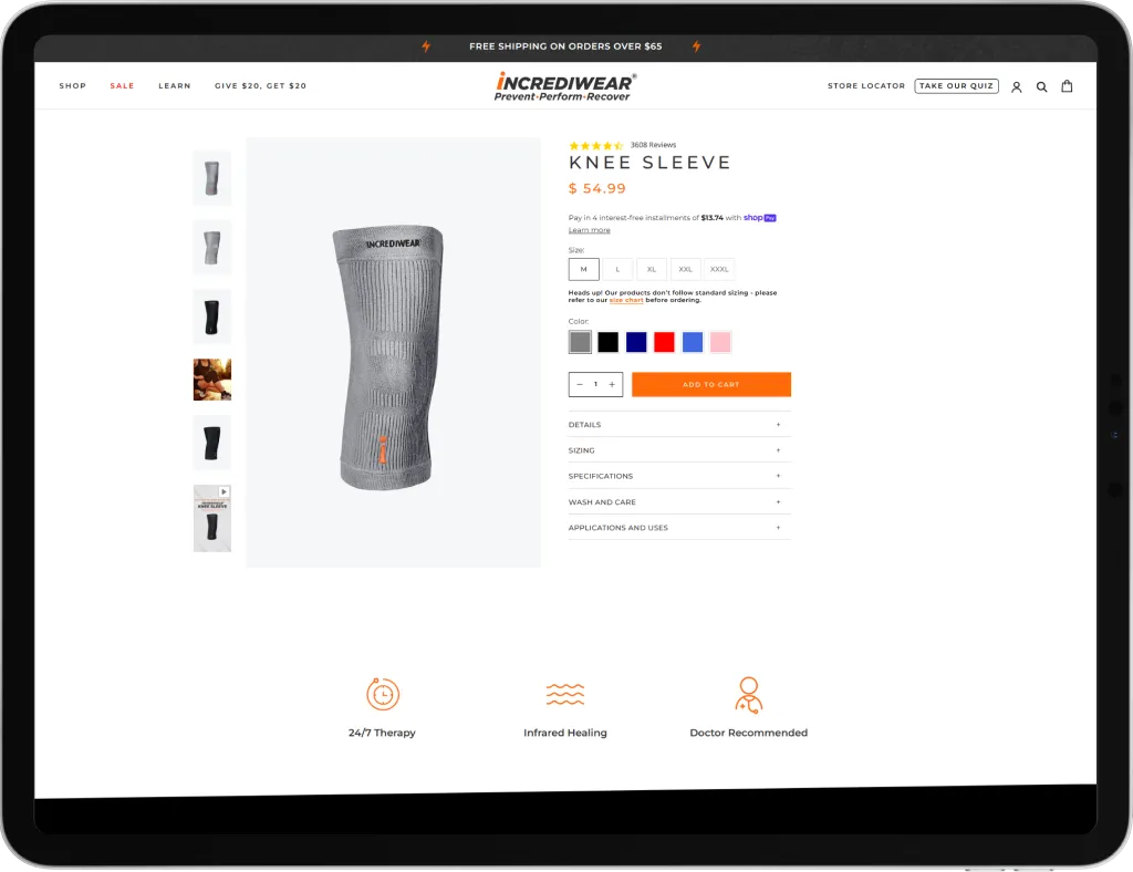
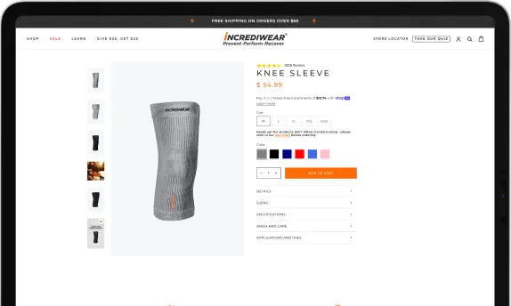
Product Page
Nunc vulputate libero et velit interdum, ac aliquet odio mattis. Class aptent taciti sociosqu ad litora torquent per conubia nostra, per inceptos himenaeos condimentum lobortis.
Shop and Product Details
(This item was also covered in the homepage)
The most popular call to action is the initial one and it takes the user to a page with too many products.
The user then has to ask:
Why some products have women and men in the product title and others don’t?
Why is showing me products that I don’t need.
The most popular call to action is the initial one and it takes the user to a page with too many products.
The user then has to ask:
Why some products have women and men in the product title and others don’t?
Why is showing me products that I don’t need.
Difficult to find information that can affect purchase decision such as returns policy (e.g free returns), free shipping? when does arrive (delivery time).
When selecting a different color the user expects the picture to update with the new selection.
Recomendations
Prioritize user journeys with clear intentions, guiding visitors with specific needs or seeking preventive support. Avoid unclear navigation flows to prevent frustration and drop-offs. Ensure all pages and navigation choices are aligned with user goals to enhance satisfaction and retention.
%20(2).webp)
%20(1).webp)
Accesibility
Text too small for mobile - Affects accessibility. Even having an accessibility section most people won’t know how to use it and will find the text hard to read on mobile.
Poor filter options: Some other filters that should be used in the catalogue page are: price, color, gender, customer top rated or review stars, on sale items.
Filter behavior: onChange instead of OnClick (dynamically updates without click apply).
Recomendations
.webp)
Mobile Text Size: Increase the font size for better mobile accessibility; the current small text and complex accessibility feature limit readability.
Filter Options: Add filters for price, color, gender, ratings, and sale status on the catalog page for improved navigation.
Mobile Text Size: Increase the font size for better mobile accessibility; the current small text and complex accessibility feature limit readability.
Favorites Feature: Introduce a 'favorites' or 'save' function to help users keep track of items of interest without immediate cart addition.
Final Result
See full page
.webp)